 designlof.
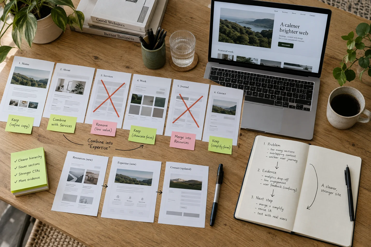
Write the visitor question
For every section, write the single question it answers for the visitor. Examples include “Is this service right for me?”, “How does the process work?” and “What proves this claim?” If two sections answer the same question, combine them or make their roles more precise.
This inventory turns vague feedback about a page feeling long into a concrete editorial decision. Length is rarely the only problem; repetition, weak evidence and missing progression are more common.
Check the sequence
A useful page changes the reader’s understanding as it moves. Establish the premise, add context, show evidence, answer likely questions and offer a next step. Each chapter should prepare the one that follows.
Move sections on paper before adjusting margins in the browser. Structural problems are faster to solve at the outline stage.
Change the pace
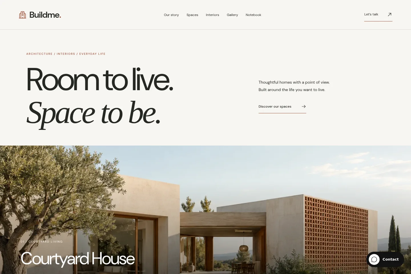
Follow dense explanation with a strong image, a concise proof point or a focused interaction. Alternate wide and narrow compositions when the content needs a different kind of attention.
Contrast gives a long page landmarks. It also helps an application screen, website preview or material detail feel connected to the argument rather than dropped between paragraphs.
- Question
- What the visitor needs
- Evidence
- What proves the answer
- Direction
- Where the story goes next
Use space as meaning
Whitespace can signal a new chapter, give an image authority or keep a decision from competing with secondary information. It should feel attached to hierarchy and grouping.
Before adding decoration, inspect alignment, line length and proximity. Many pages feel empty because related elements are too far apart, not because they need more content.
Edit the interface language
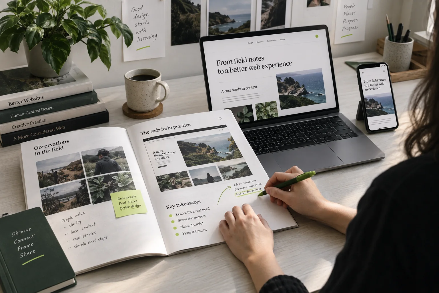
Repeated cards, vague buttons and generic headings make different sections feel identical. Use labels that describe the actual content and vary the composition when the job changes.
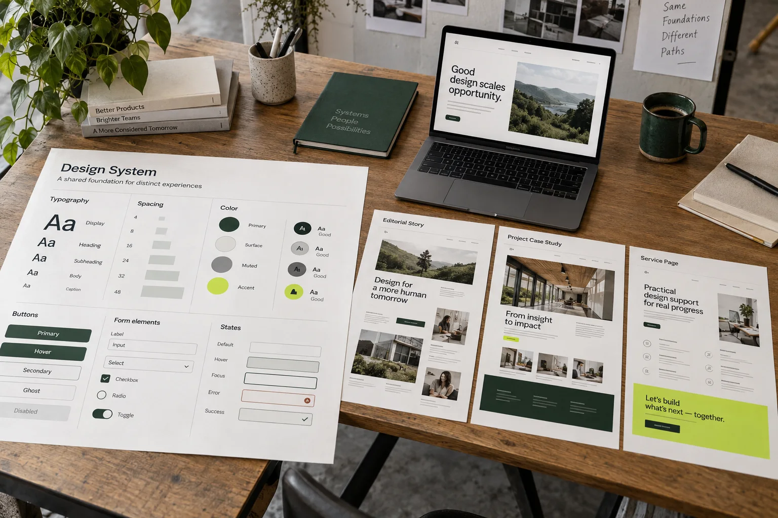
A system should support those changes without losing consistency. Shared typography and spacing can hold together a full-width visual, a metric row and a compact practical note.

Run the 30-minute section audit
Create a table with five columns: section name, visitor question, evidence supplied, next section and decision. Give each chapter one decision: keep, combine, rewrite, move or remove. Ten minutes is enough to expose duplicated promises, testimonials without context and visual sections that do not advance the story.
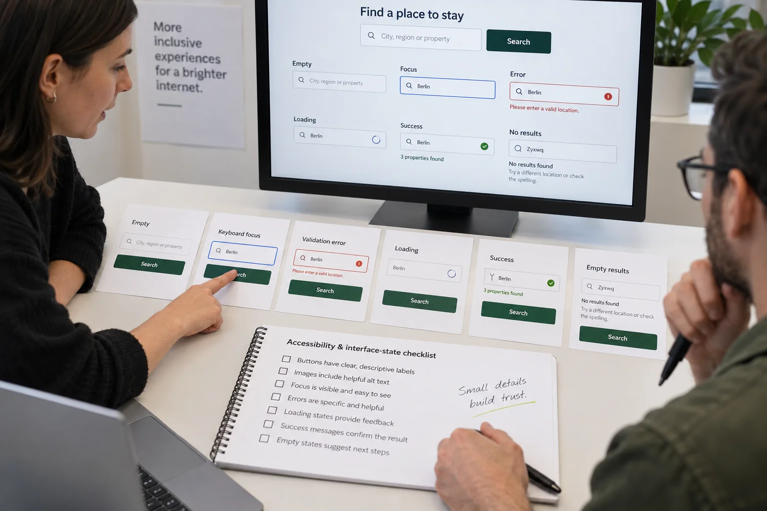
Next, read only the headings from top to bottom. They should form a coherent summary without the paragraphs. Then read every button label. Each should describe a destination or action rather than repeat “Learn more.”
End with direction
The final section should resolve the story and make the next action feel natural. Summarize what the reader now knows, name any remaining uncertainty and offer one appropriate next step.
After editing, ask someone unfamiliar with the page to answer three questions: What is offered? Why should I believe it? What can I do next? If the answers take more than a minute to find, the page still needs structural work.
Until the next discovery.

Conversation